DESIGN COLLABORATION: AGILE & CROSS-FUNCTIONAL TEAMS
2 week sprint to launch credit card ‘Eligibility Checker’ V2

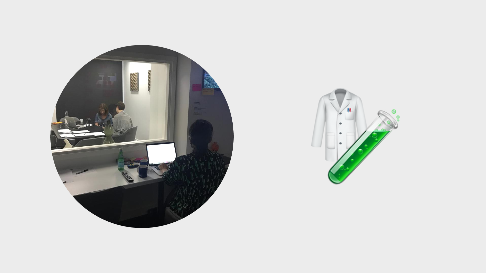
TEAM
2 Full Stack Developers, Content designer Data Scientist, Compliance lead and Product Lead
ROLE
Product Design Lead
KEY SKILLS
Workshop facilitation, Cross-functional collaboration, User testing, Prototyping, Stakeholder management, Validation with mettics
TOOLS
Figma, Whiteboard, Pen and Paper
Impact
+23% Conversion rate
-22% Bounce rate on results page
Established a new ‘cross-functional’ way of working
Embedded design thinking into the process
Problem
Context
Eligibility checker was recently launched and receiving a lot of traffic but we wanted to personalise the experience to be more useful for our users.
Problem Statement
Over 1,000 users a month were applying for credit cards they were not eligible for, this would likely negatively impact their credit score therefore giving a bad user experience on the uSwitch credit card site.
Why was this important?
Business goal
Reduce the amount of users applying for low eligibility credit cards therefore increasing our conversion rate.
User goal
Educate users on what to do if they had a lower credit score. Additionally if possible direct users with lower credit scores to products that they were more likely to be eligible for.
Process
Discover
It had come to light in our weekly meeting that over 1,000 users a month were applying for credit cards that they were very unlikely to be approved for (0-10% eligibility rating). Our business model relied on users being accepted for cards in order to generate revenue. We decided as a team that this was a problem we wanted to solve.
OLD DESIGN
Over 1,000 users each month were applying for a credit card with a 0-10% eligibility rating.
Google analytics: Funnel analytics

We had a kick-off session around the issue that had been raised. I suggested we used a Sprint approach to work as a team cross-functionally around a problem and the team agreed We decided to work on this over 2 weeks as the team had other commitments during the week:
SPRINT APPROACH & CUSTOMER INTERCEPTS

USER INTERCEPT FINDING
Most users were unaware that being rejected for a credit card would likely negatively impact their credit score.
THE PLAN
DAY 1 +2
🎯
Make a map and choose a target
DAY 3 + 4
✏️
Sketch competing solutions
DAY 5 + 6
👇🏼
Decide on the best
DAY 7 + 8
🔨
Build a realistic prototype
DAY 9 + 10
🧪
Test with target customers
Define
The eligibility checker flow had 3 main steps. The credit card results that were shown based on the eligibilty of that user. Therefore we decided to segment the users based on those results that were linked to the credit history.
CHOOSING A TARGET: SEGMENTING THE USER GROUP
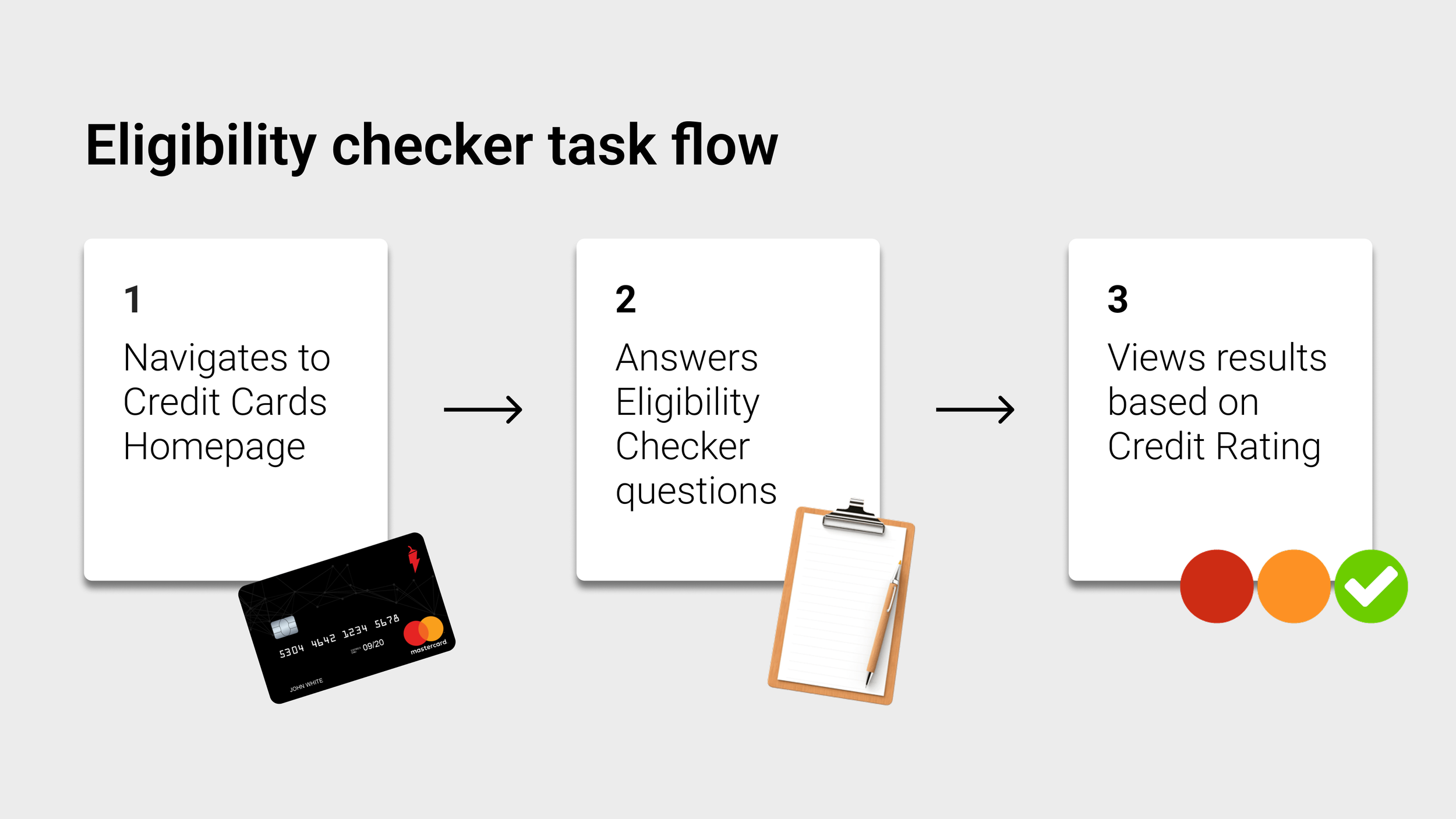
3 USER GROUPS BASED ON ELIGIBILITY:
Stop and Learn
(0-10%) <- THE TARGET
Pause and consider
(11 - 40%)
Continue and choose
(41% -100%)
Ideate
We agreed as a team that the messaging would be key to the success of the test at the end of the sprint. Therefore I collaborated heavily with content designers and compliance to develop designs and messaging. Sketched out ideas as a team, decided on a route that would a summary message at the top and develop a visualise to represent the eligibilty rating.

HOW MIGHT WE?
Colour code the button or graphic to match eligibility?
Show results to users that only had 15% of less eligible cards?
What content could we create to support users?
How might we introduce the results to users with a summary?
SKETCH COMPETING SOLUTIONS: MESSAGING

Prototype & Test
We kept the design changes as small as we could to deliver the impact and therefore decided to code a prototype that we could push live to test in the lab.

Testing using our on site user lab with viewing room.
USER INSIGHTS FROM TESTING
INSIGHT 1
Users unsure why they were seeing results that they had a very low eligibility for.
INSIGHT 2 (CONFIRMED):
Users were unaware that being rejected would likely negatively impact their credit score.
INSIGHT 3
Users wanted more support and advice from uSwitch as a brand.
Develop
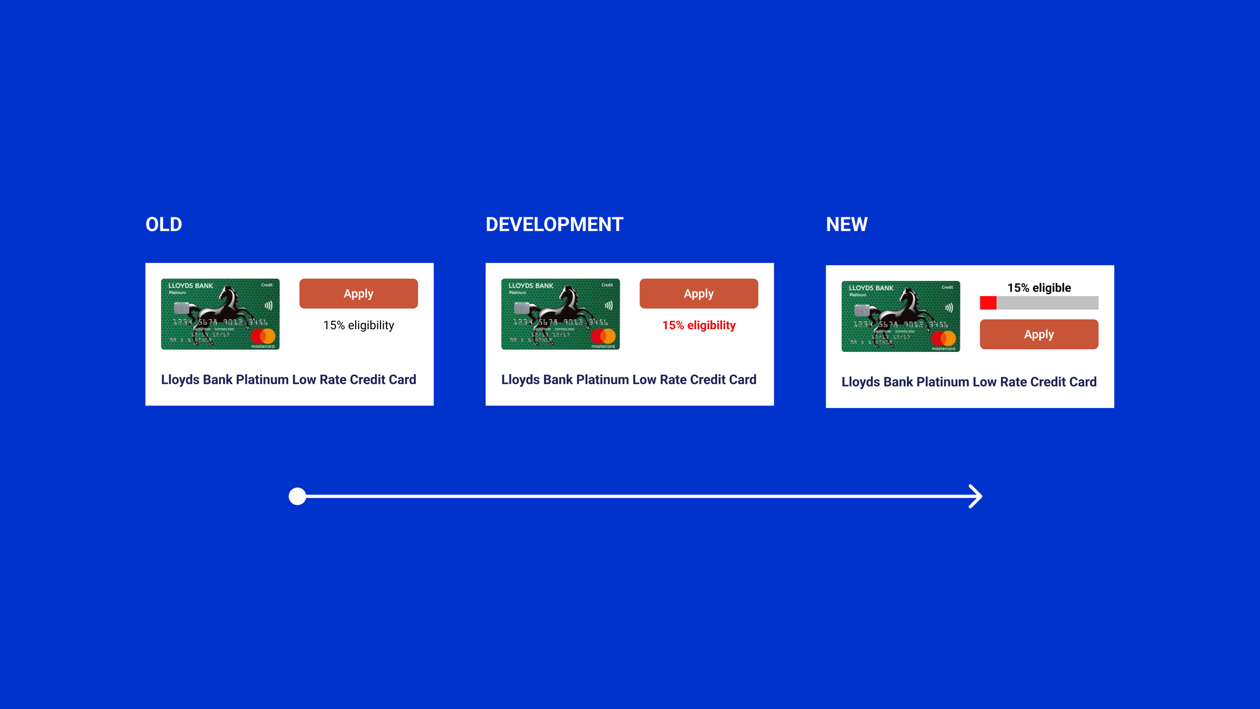
Based on the feedback from users we changed four elements in the design:
Stop and pause message to guide users and educate
Results organised by highest eligibility first
Adapted results intro message with icon to summarise the user results
Colour coded % bar above CTA to bring clarity before applying
3 DESIGN OPTIONS FOR 3 USER GROUPS
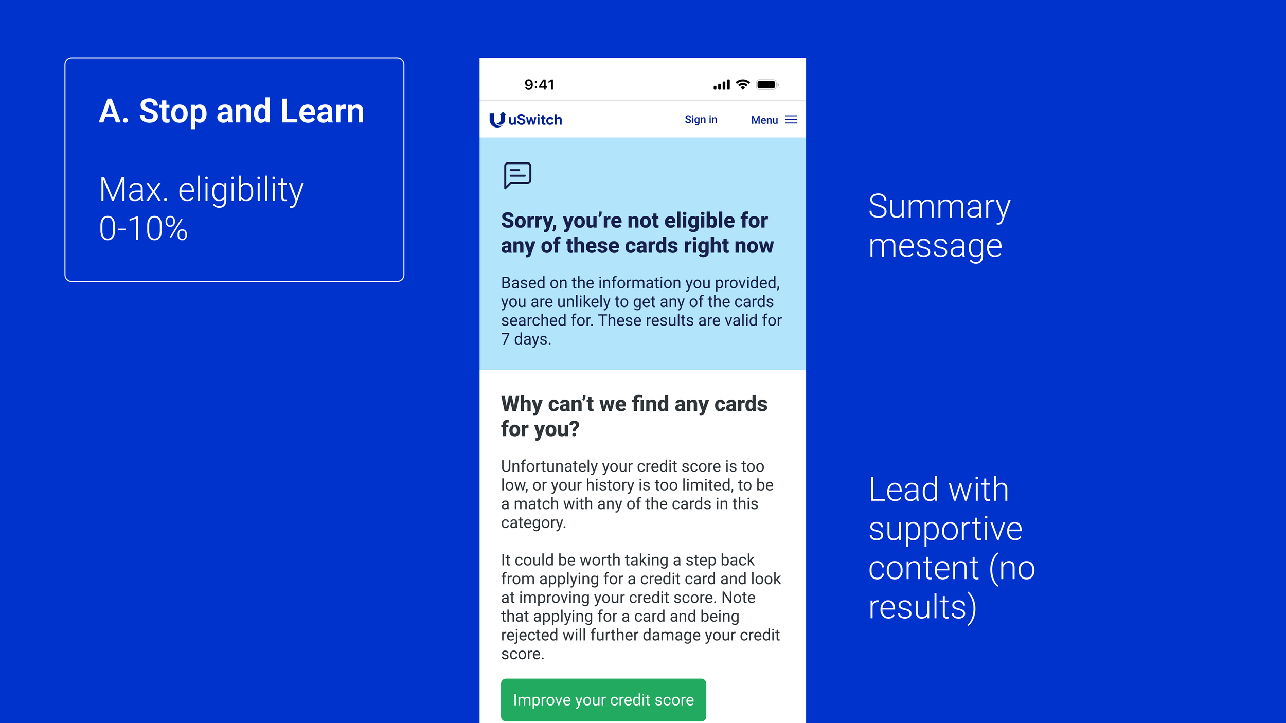
A. STOP AND LEARN
No results shown under 11% eligibility
Show message to explain why there are no results
Link to content about how to improve credit score

B. PAUSE AND CONSIDER
Show results from 40% to 11% eligibility
Show message under first result to explain that it might be worth taking a step back
Orange eligibility bar to highlight lower eligibilty
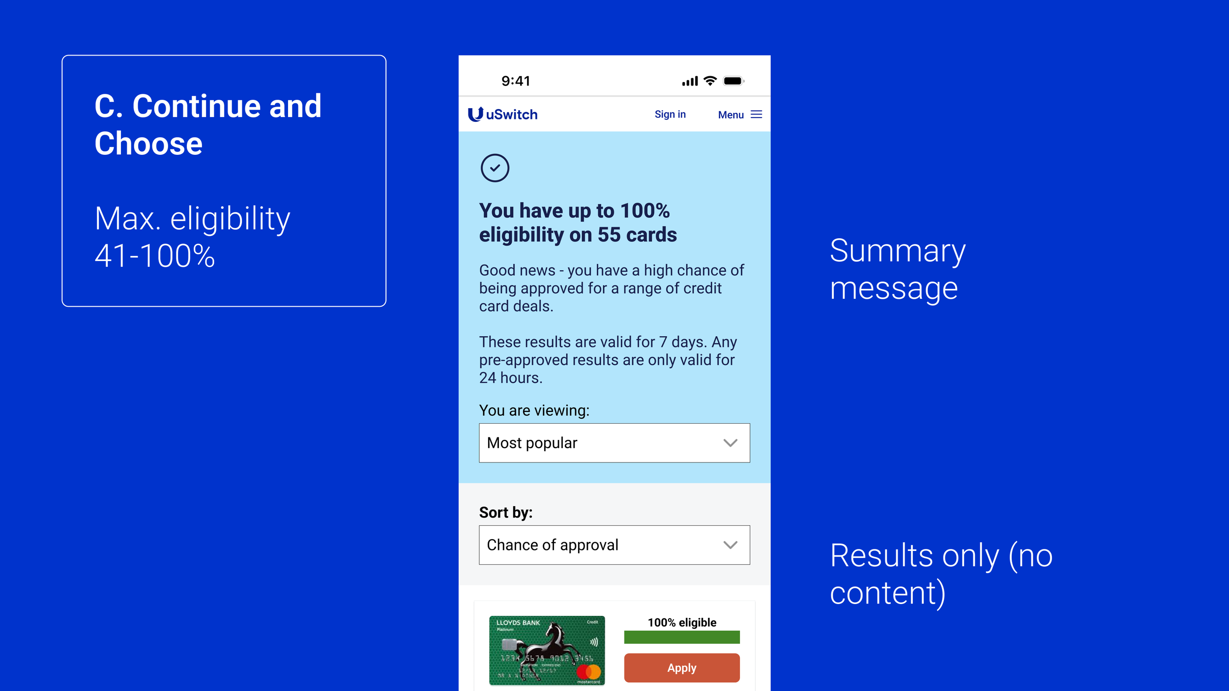
C. CONTINUE AND CHOOSE
Show results from 100% down to 11%
Show updated legibility bar with coloured bar
No content shown to these users
Validate
After testing and making design developments we pushed live to 5% of our audience and monitored the funnel and traffic. The results were encouraging so we pushed live to 100% of our user base on the following Monday morning.
Launch
After rolling out to 100% of our users on the Monday morning and then again monitored traffic. The numbers were better than we thought and positively impacted both users and our approval rate which was a win win. We also developed a new way of working as a team and the feedback was that we wanted to continuing doing this at a regular cadence.
FINAL DESIGNS

Impact
+23% Conversion rate
-22% Bounce rate on results page
Established a new ‘cross-functional’ way of working
Embedded design thinking into our process
COLLABORATION
“This was the best project I was part of at uSwitch. We were able to own a specific problem in the customer journey. The whole team rallied together to create a solution quickly and could continue to iterate on it in a true agile fashion. “
Lead Developer, uSwitch
Other projects
-
![Four smartphone screens displaying the Everyman app features: Discover movies, Book tickets for Fantastic Beasts, Watch screen with Everyman welcome message, and Listen to soundtracks like Bohemian Rhapsody.]()
Crafting a seamless booking experience for a boutique cinema
DESIGN QUALITY: CRAFT & EXECUTION
-
![]()
Leading a team to design a predictive AI SaaS tool
DESIGN LEADERSHIP: PROCESS & INFLUENCE
-
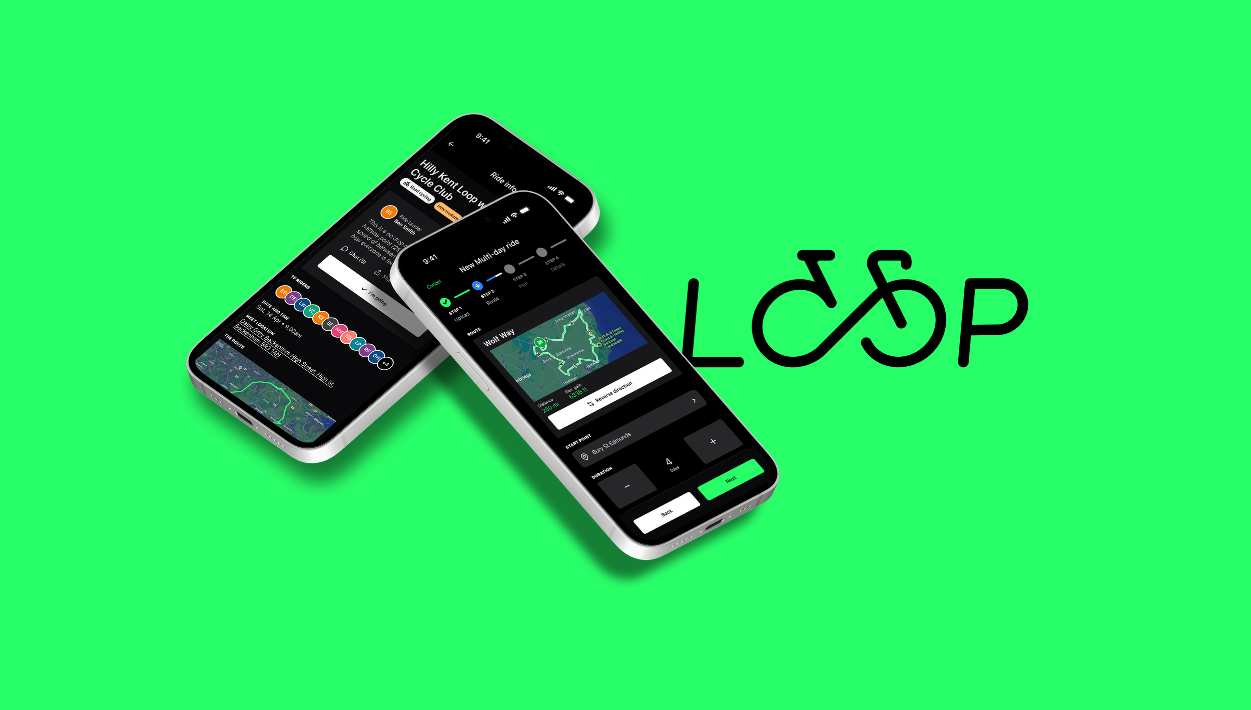
![Logo reading 'LOOP Cycle Club' with an infinity symbol integrated into the word 'LOOP' against a black background.]()
Designing and building an app to connect cyclists
DESIGN INNOVATION: BUILDING 0-1